Types of Layout Parts and Property Options†
Types of Layout Parts†
Layouts are created by combining layout parts.
To see how each part is used, you can refer to the default layout data or the layout data of a sample game.
In particular, the title screen, menu screen, config screen, and battle status screen will be helpful in using the various parts.
Containers†
Containers are the base parts of the layout that bind the various elements together.
A container can have other containers or panels as child elements. (Container for Entry Selection only, it cannot be a child of another container.)
| Icon on the Tree | Container Name | Description |
|
| Menu Container | This container is the base for the screen menu. It cannot be placed as a child of another container. Also, with the exception of some screens, only one can be placed on each screen.
Information such as the cursor used in menus and page feeds are also specified in this container. |
|
| Submenu Container | This container is used as selections in the menu. You can specify what to do when a selection is made in the game, and what screen to open.
This container can only be placed as a child of a menu container. |
|
| Rendering Container | A container that can organize elements to be rendered.
It can also be used simply to display still images. |
Panels†
A panel is "an element that will be displayed in the layout". Panels cannot have children. It can be used by itself or belong to a container.
| Icon on the Tree | Container Name | Description |
|
| Text Panel | This panel displays in-game parameters specified by text or special formats. Depending on the special format you specify, images may also be displayed.
(e.g., specifying the special format \equipimage[] will display the equipment item image specified in the Database).
This panel, used to display in-game parameters and images, will be used very often. |
|
| Sprite Panel | This panel displays the specified sprite.
Sprites created using the Sprite Tool can be displayed, including images. |
|
| Slider Panel | This panel is used to display the HP gauge and sliders for volume control and other operations using the thumb (knob).
It can be used for specific actions specified by the parent container. |
|
| Spin Panel | This panel provides a mechanism for selecting text entries with left and right input operations. It is used in situations where "Fast/Normal/Slow" is selected by toggling the left and right keys.
It can be used for specific actions specified by the parent container.
Currently, it only takes effect in the "Config" screen. |
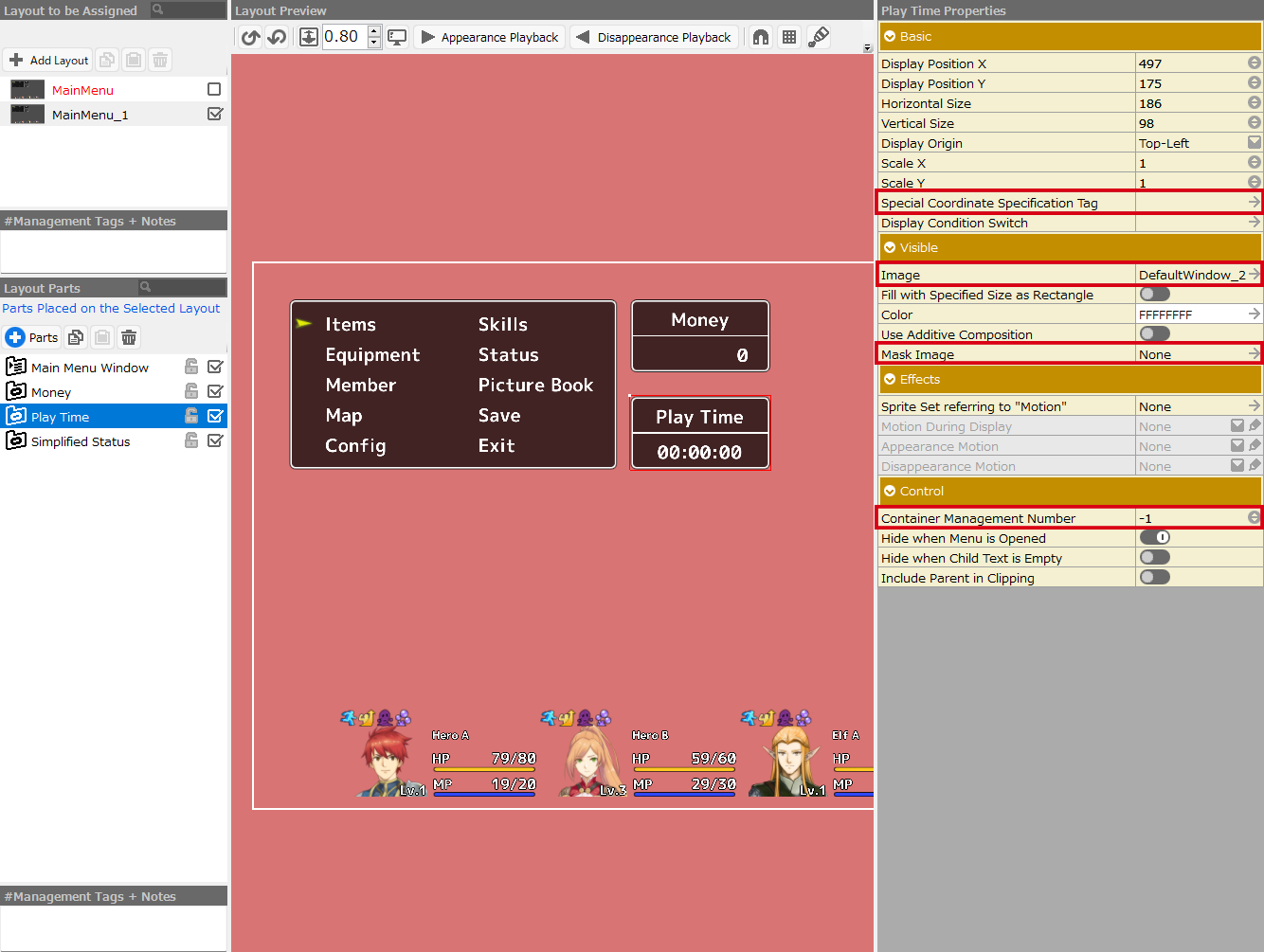
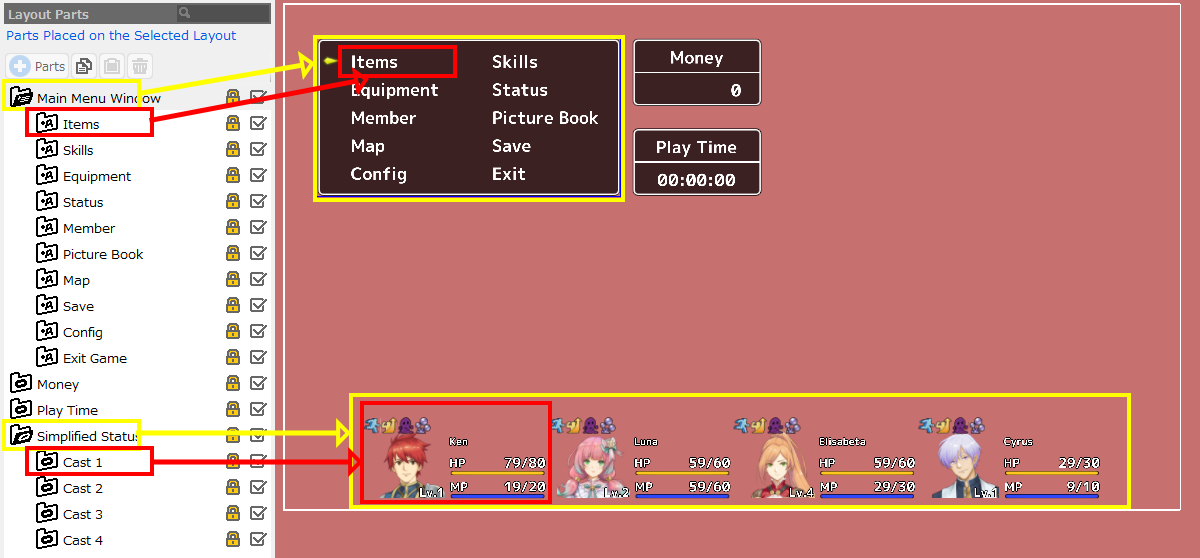
The figure below shows the system layout (default layout) of the "Menu" screen.
- The "Main Menu Window" container is a menu container.
It is the foundation for submenu containers such as items and skills .......
It also manages the size of submenu containers, spacing between containers, and cursor position.
- The "Items" container is a submenu container.
"Skills" and "Equipment" ...... are likewise submenu containers.
Submenu containers are menu selections and can only be placed as children of a menu container.
This container manages which menu to move to when this section is selected.
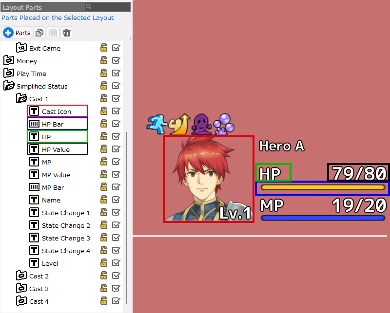
- The "Simplified Status" container is a Container for Rendering.
The "Cast 1" to "Cast 4" containers, which are also rendering containers, are included as children of the "Simplified Status" container.
Container for Rendering can also specify an image to be displayed, but no image is assigned to the container here.
The face icon and the various values and gauges displayed in the "Cast 1" container are shown in the various panels arranged as children of the container.
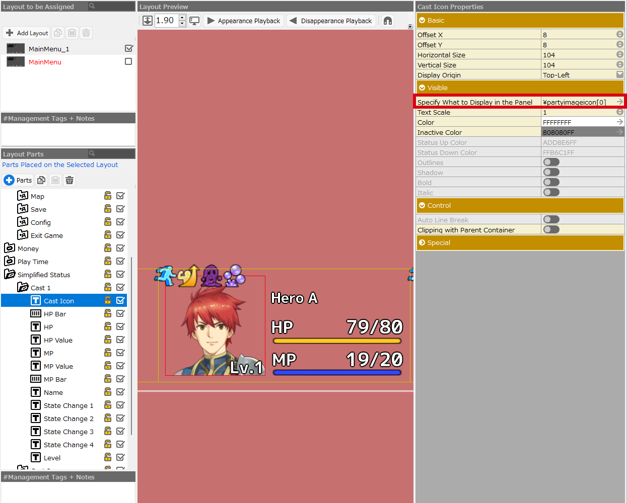
The figure below shows the cast parameter display section at the bottom of the system layout (default layout) on the "Menu" screen.
You can see that most of the display objects are made of "Text Panels".
The "Cast Icon: red frame" is displayed with the special format specifying "the icon of the cast specified in Database > Casts or the image of the cast when moving".
The "HP: green frame" designates just the text "HP".
The "HP value: black frame" is displayed in a special format, specifying the "current HP of the first character in the party" and the "MaxHP of the first character in the party".
The "HP bar: blue frame" uses a slider panel to display the current HP value in the form of a gauge.
Menu Container†
The menu container is the foundation of the so-called "menu".
The menu window itself is the "menu container" and the selections on top of it are the "submenu containers".
Key Properties†
The followings are some of the key property options of the menu container.
- Mask Image
By specifying an image for the mask, the container's child elements can be cropped.
Images with alpha can also be used for mask images.
Download the Mask Image Sample and try it out by specifying it as the "Mask Image" for your container.
It will be easier to understand the effect if the "image" of the container to be specified in that case is left unset.
In addition, simple mask shapes such as a square and a circle are available in the Images>reserved>Primitive folder.
- Effects
This is where you can specify the motion for the menu window to appear or disappear.
Motion is specified as created by the Sprite Tool.
Select a sprite set from the "Sprite Set referring to "Motion"" section and assign the motion contained in the sprite set to the Appearance, Motion During Display, and Disappearance motions.
A sprite set called "LayoutAnimation" is assigned as default data, so please select the necessary motion from it.
If you would like to create a new motion, use the Sprite Tool to create a "sprite".
The "LayoutAnimation" specified by default is located in the reserved folder under Resources > Sprites.
First, let's copy and paste this data and then modify it with the Sprite Tool.
Note that "Effects" refers only to the movement of the sprite, not to the image specified in the Sprites.
However, if "sprite with mask specified" is assigned, the mask information is reflected along with the movement.
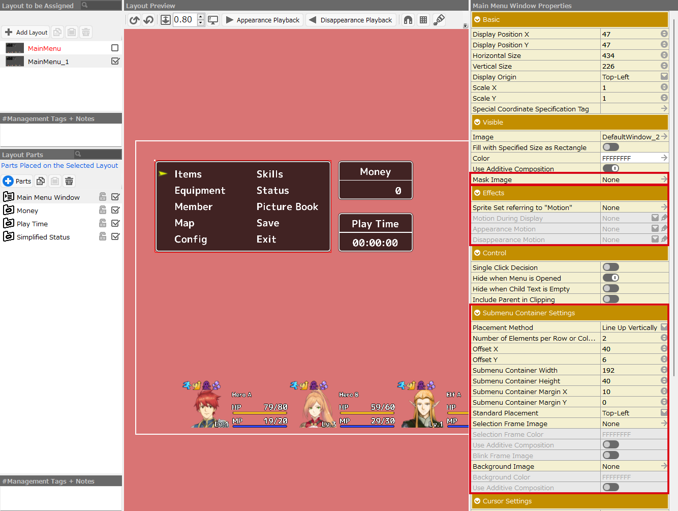
- Submenu Container Settings
The size of the "submenu containers" and the spacing between containers are specified in this section of the menu container.
The "Items" under the Main Menu Window in the Layout Parts List is a "submenu container," but its size and position (offset) from the menu origin are specified in this section.
Note that the "Offset" in the "Submenu Container" property is the value that will be added to the offset specified in this section.
- Menu Container Properties are Long
The properties of the menu container contain many options.
Move the scrollbar to reveal the cursor and page mark settings at the bottom of the Properties section.
It is easy to miss them, so please keep them in mind.
Menu Container Properties†
- Basic
Specify basic settings such as the position of layout parts.
- Display Position X
Specify the X Coordinate of the layout part.
- Display Position Y
Specify the Y Coordinate of the layout part.
- Horizontal Size
Specify the width of the display size of the layout part.
- Vertical Size
Specify the height of the display size of the layout part.
- Display Origin
Specify the display origin of the layout part.
- Scale X
Specify the display scale of the horizontal (X) axis of the layout part.
- Scale Y
Specify the display scale of the vertical (Y) axis of the layout part.
- Special Coordinate Specification Tag
By specifying this tag, this part will be displayed at the origin of each tag specified on the Bakin side during events and battles.
If this tag is specified, the basic property display position X,Y will be the offset value from this tag.
Click the arrow to display the Special Coordinate Specification Tag insertion dialog, and select a tag from it.
The dialog shows only the tags that are valid for that screen.
See Special Coordinate Specification Tag Insertion Dialog for more information on special coordinates specification tags.
- Visible
Specify settings related to the display of layout parts, such as images.
- Image
Specify the underlying image (background or window frame) for the container.
- Fill with Specified Size as Rectangle
Fill the area set in "Basic" with the specified color.
- Color
Multiply the specified image or rectangle by the color specified here. You can also create an image in all white and use this entry to specify the display color.
- Use Additive Composition
Normally, color calculation is performed by multiplication, but when the switch is turned on, color calculation is performed by addition and the window is displayed.
- Mask Image
By specifying an image for the mask, the container's child elements can be cropped.
- Effects
Specify settings related to effects such as the appearance and disappearance of layout parts.
- Sprite Set referring to "Motion"
Specify the sprite set to be used for the effects of the layout.
Information other than "Image" of the assigned sprite set and the "Mask" setting are referenced.
"LayoutAnimation" is specified as the default data.
- Motion During Display
Specify the motion being displayed.
- Appearance Motion
Specify the motion at appearance.
- Disappearance Motion
Specify the motion at disappearance.
If any motion is assigned in the Motion field above, clicking on the pen icon will launch the Sprite Tool, which allows you to directly edit the motion.
- Control
Specify the behavior of the layout parts.
- Single Click Decision
When turned on, the menu displayed in this container can be determined with a single click.
- Hide when Menu is Opened
Hide this container when the menu is opened.
- Hide when Child Text is Empty
If there is no information to display in the text panel within the container, this container itself is hidden.
(e.g., to display casts and status with special formats.)
- Include Parent in Clipping
When calculating the size of the clipping, a rectangle is generated that includes the parent container.
- Submenu Container Settings
Specify options related to the position and display of submenu containers (Containers for Elements of Entry Selection).
- Placement Method
Specify how the submenu containers will be positioned. Choose from two types: horizontal or vertical.
- Number of Elements per Row or Column
Specify the number of elements per row or column.
When aligned vertically, the cursor moves with the up/down keys.
- Padding X
It can only be set in the Conversation > "Selection" screen.
You can specify the left and right padding values for the submenu container.
- Padding Y
It can only be set in the Conversation > "Selection" screen.
You can specify the upper padding value for the submenu container.
- Offset X
Specify the position of the submenu container within this container. Specify the distance (X) from the origin of this container.
- Offset Y
Specify the position of the submenu container within this container. Specify the distance (Y) from the origin of this container.
- Submenu Container Width
Specify the width size of the submenu container.
- Submenu Container Height
Specify the height size of the submenu container.
- Submenu Container Margin X
Specify the horizontal size of the margins around the submenu container.
- Submenu Container Margin Y
Specify the vertical size of the margins around the submenu container.
- Standard Placement
Specify the standard point for placement of the submenu container.
- Selection Frame Image
Specify the image to be displayed when the submenu container is selected.
Although it is labeled "frame," any image other than the frame is acceptable.
- Selection Frame Color
Multiply the image in the selection frame by the specified color. You can also create an image in all white and use this entry to specify the display color.
- Use Additive Composition
If turned on, the color specified in "Selection Frame Color" will be added to the color of the "Selection Frame Image" instead of being multiplied.
- Blink Frame Image
If turned on, the "Selection Frame Image" will blink.
- Background Image
Specify a background image for the submenu container.
- Background Color
Multiply the background by a specified color. You can also use this option to create an image in all white and specify the display color.
- Use Additive Composition
If turned on, the color specified in "Background Color" is added to the color of the "Background Image" instead of being multiplied.
- Cursor Settings
Specify settings related to the cursor that points to entries.
- Selection Cursor Sprite Set
Specify the sprite set to be displayed as a cursor.
- Selection Cursor Displaying Motion
Specify the motion while the selection cursor is displayed.
- Selection Cursor Inactive Motion
Specify the motion when the selection cursor is inactive.
- Selection Cursor Appearance Motion
Specify the motion when the selection cursor appears.
- Selection Cursor Disappearance Motion
Specify the motion when the selection cursor disappears.
- Cursor Offset X
Specify the horizontal distance from the cursor and the origin of the submenu container that the cursor will contact.
- Cursor Offset Y
Specify the vertical distance from the cursor and the origin of the submenu container that the cursor will contact.
- Whether to Interpolate Cursor Position
Specify the interpolation method for the movement of the cursor to the next position.
- Time Required to Interpolate Cursor Position
Specify the time (in seconds) to interpolate the cursor position.
- Page Mark Settings
Specify settings related to indicators when menu selections span multiple pages.
- Display
Specify whether to display the page mark.
The image used for the page mark can be specified in Game Definition > System Resources.
- Hide When Within 1 Page
When the switch is turned on, the page mark is hidden when all entries fit on one page.
- Offset X
Specify the distance to shift the page mark in the horizontal (X) direction from the reference position.
- Offset Y
Specify the distance to shift the page mark in the vertical (Y) direction from the reference position.
- Page Position Current
If the display entries span multiple pages, specify an image to display the current page position.
The image specified here takes precedence over the image specified in Game Definition > System Resources.
- Page Position
Specify a graphic to indicate that the display entries span multiple pages.
The image specified here takes precedence over the image specified in Game Definition > System Resources.
Submenu Containers†
Submenu containers are "menu entries" that can be selected by moving the cursor.
They can only be placed as children of a menu container.
Note that the size of the container and the order within the menu are specified in the parent menu container.
This container, on the other hand, allows you to specify the behavior of the selected entry, etc.
Key Properties†
This section describes the key property options of the submenu containers.

- Action and Layout to be Opened
The "Action" option specifies what happens when a player selects a submenu container (moves the cursor over it and presses the "Decide" button) during a game.
Then, "Layout to be Opened" specifies which layout will be opened when that "Action" occurs.
In the above image, pressing the decision button at "Items" during the game will trigger the "Display Item Menu" action specified in the property "Action" and open the "ItemSelect" layout of the Item Selection screen specified in the "Layout to be Opened" property.
This is the section to pay special attention to when creating a layout and checking it through test play or other means.
For example, you may have created a new layout "NewItemSelect" for the Item Selection screen and decided to try it out to see how it looks in the game, but when you play the test and press the decision button under "Items" in the menu, the layout you created does not appear.
The problem is most likely caused by not specifying "NewItemSelect" in the "Layout to be Opened".
Please take a look at the Action section of the submenu containers on the various screens and use it as a reference for your creation.
- Action "Call Common Event"
There is an action that can call a common event by pressing the decision button.
The common event to be specified must be created in advance in the Map Editor > Common Event Palette.
For example, create an event where everyone's HP is recovered.
If you have an entry in the menu that specifies the action that calls the event, you can simply select that entry during the game to recover all of the party members' HP.
- Property Entries Change Depending on the "Action" Specified
For example, "Common Event" will not be displayed unless "Call Common Event" and "Close and Call Common Event" are specified in the "Action" section.
Depending on the "Action," entries that do not make sense to specify will not be displayed.
Submenu Container Properties†
- Basic
Specify basic settings such as the position of layout parts.
- Offset X
Specify the offset value in the horizontal (X) direction from the position specified in the parent menu container.
The value is added to the value of the menu container's Submenu Container Settings > Offset X.
- Offset Y
Specify the offset value in the horizontal (Y) direction from the position specified in the parent menu container.
The value is added to the value of the menu container's Submenu Container Settings > Offset Y.
- Display Condition Switch
Assign an event switch to show/hide this part depending on its state.
- Effects
Specify settings related to the effects, such as the appearance and disappearance of layout parts.
See also the description of the Menu Container Effects.
- Sprite Set referring to "Motion"
Specify the sprite set to be used for the effect of displaying the layout.
Information other than "Image" of the assigned sprite set and the "Mask" setting are referenced.
- Motion During Display
Specify the motion being displayed.
- Appearance Motion
Specify the motion at appearance.
- Disappearance Motion
Specify the motion at disappearance.
- Decision Motion
Assign the motion when this submenu container is selected and the decision button is pressed.
If any motion is assigned in the Motion field above, clicking on the pen icon will launch the Sprite Tool, which allows you to directly edit the motion.
- Control
Specify the behavior of the layout parts.
- Submenu Container to Select When Pressing Up
- Submenu Container to Select When Pressing Down
- Submenu Container to Select When Pressing Left
- Submenu Container to Select When Pressing Right
You can specify which submenu container the cursor will move to depending on the direction of the player's input.
Note that some submenu containers may be generated that are not selected depending on what is specified.
- Action
Specify the action to be taken when this entry is selected.
- Input to Execute Action
The action is executed when the specified input occurs.
Which key/button is assigned to the input to be set can be specified in "Assign Input Device" under Game Definition > Rules and Operations.
- Layout to be Opened
Specify the layout to be opened when this entry is selected. Select from the screen layouts specified in the "Action" section.
- Hide Parent Container when Layout is Opened
Specify whether to hide the "Container for Entry Selection" to which it belongs when the specified layout is opened.
- Common Events
Specify common events to be executed when selected.
It is necessary to create a common event to be executed first. It is also necessary to specify "Call Common Event" or "Close and Call Common Event" as the action of this container.
- Hide Parent Container when Layout is Opened
Specify whether to hide the menu container to which it belongs when the specified layout is opened.
- Display Selection Frame Image
When this container is selected, specify whether the selection frame image specified in "Submenu Container Settings" of the menu container should be displayed.
- Display Cursor
Specify whether the selection cursor specified in "Submenu Container Settings" of the menu container will be displayed when this container is selected.
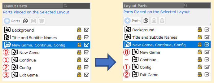
- Disable Auto Assignment Container Management Number
Container Management Numbers for submenu containers are usually assigned automatically from the top entry in the layout parts tree. (If it is not a child of a menu container, no number is assigned.)
However, if this option is turned on, the number can be removed from automatic assignment.
This function is used, for example, when specifying selections for sorting on the Item Selection screen.
Please refer to the "Dungeon RPG Sample" project in the Top Menu > Game Gallery, which uses this feature in the layout of the Item Selection screen.
The left side of the figure below shows the state when Container Management Number is automatically assigned. (The red numbers 0 to 3 represent Container Management Number.)
The right side of the figure below shows a case in which this option is turned on for the "Continue" container and no Container Management Number is automatically assigned.
Rendering Containers†
The rendering container is an easy-to-use container for organizing display elements that are not involved in the "menu".
It can also be used to simply display still images.
Key Properties†
This section describes the key property options of the rendering containers.
- Special Coordinate Specification Tags
"Tags" are for parts that can be positioned by events such as selections or conversation windows, or for parts that have uses such as displaying battle parameters close to the cast members...etc.
For example, tags such as "TopLeft" and "Center" specified for each container on the "Selection" screen in the system (default) layout are tags that are used in the event panel "Select from Selection and Check Results".
It is also used on the "Conversation" screen and the "Battle Status" screen, but can also be utilized on various other screens.
In the Special Coordinates Specification Tag Insertion Dialog, only tags that are valid for that screen can be specified.
- Image
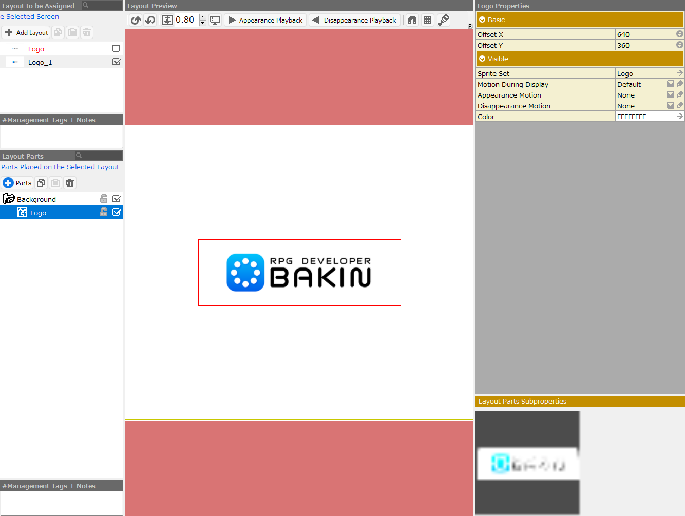
By simply specifying a still image in the "Image" of the rendering container, it can be used as a part to produce a single picture.
- Mask Image
By specifying an image for the mask, the container's child elements can be cropped.
Images with alpha can also be used for mask images.
Download the Mask Image Sample and try it out by specifying it as the "Mask Image" for your container.
It will be easier to understand the effect if the "image" of the container to be specified in that case is left unset.
- Container Management Number
This number affects the "special formats" used in the text panels that are children of this container.
The "-1" is equivalent to "no number".
Rendering Container Properties†
- Basic
Specify basic settings such as the position of layout parts.
- Display Position X
Specify the X Coordinate of the layout part.
- Display Position Y
Specify the Y Coordinate of the layout part.
- Horizontal Size
Specify the width of the display size of the layout part.
- Vertical Size
Specify the height of the display size of the layout part.
- Display Origin
Specify the display origin of the layout part.
- Scale X
Specify the display scale of the horizontal (X) axis of the layout part.
- Scale Y
Specify the display scale of the vertical (Y) axis of the layout part.
- Special Coordinate Specification Tag
By specifying this tag, this part will be displayed at the origin of each tag specified by Bakin during events and battles.
If this tag is specified, then Properties>Basic>Display Position X,Y are the offset values from this tag.
Click the arrow to display a dialog box for selecting a special coordinate specification tag.
- Display Condition Switch
Assign an event switch to show/hide this part depending on its state.
- Visible
Specify settings related to the display of layout parts, such as images.
- Image
Specify the underlying image (background or window frame) for the container.
- Fill with Specified Size as Rectangle
Fill the area set in "Basic" with the specified color.
- Color
Multiply the specified image or rectangle by the color specified here. You can also create an image in all white and use this entry to specify the display color.
- Use Additive Composition
Normally, color calculation is performed by multiplication, but when the switch is turned on, color calculation is performed by addition and the window is displayed.
- Mask Image
By specifying an image for the mask, the container's child elements can be cropped.
- Effects
Specify settings related to the effect of layout parts, such as their appearance and disappearance.
See also the description of the Menu Container Effects.
- Sprite Set referring to "Motion"
Specify the sprite set to be used for the effect of displaying the layout.
Information other than "Image" of the assigned sprite set and the "Mask" setting are referenced.
- Motion During Display
Specify the motion being displayed.
- Appearance Motion
Specify the motion at appearance.
- Disappearance Motion
Specify the motion at disappearance.
If any motion is assigned in the Motion field above, clicking on the pen icon will launch the Sprite Tool, which allows you to directly edit the motion.
- Control
Specify the behavior of the layout parts.
- Container Management Number
Specify the container number to be used for special formats, as specified by child elements placed in the hierarchy immediately below this container.
For special formats related to party members, "0" indicates the first member, "1" indicates the next member, and for enemy groups, "0" indicates the first enemy, "1" indicates the second enemy, and so on. A "-1" indicates "not specified".
- Hide when Menu is Opened
Hide this container when the menu is opened.
- Hide when Child Text is Empty
If there is no information to display in the text panel within the container, this container itself is hidden.
(e.g., to display casts and status with special formats.
- Include Parent in Clipping
When calculating the size of the clipping, a rectangle is generated that includes the parent container.
- Auto Size Adjustment
You can specify whether this container should automatically adjust its size as the parent container resizes.
It can be used on the "Input String" and "General Message" screens.
Text Panels†
This panel displays in-game parameters specified by text or special formats.
The name is a string, but depending on the special format you specify, an image may be displayed.
This is a very widely used panel.
Key Properties†
This section describes the key property options of the text panel.
- Specify What to Display in the Panel
Specify what to display in this text panel.
Clicking on the entry field opens a dialog box and displays the information you have entered.
Multiple lines can also be entered.
Special formats in the list can be used to display values, images, and text specified in the "Database" menu and other menus.
The description section of the format describes what can be displayed by using that format.
Special Formats†
Special formats allow you to display values, images, and text specified in the "Database" menu and other menus in the text panel.
For example, the HP value of a cast, the name of an item in the item list, or the icon image of a cast on the status screen can be displayed by specifying a special format in the text panel.
Some special formats specify one or two parameters.
The following is an example of a description with two parameters.
\partystatus[0][0]
Special formats can also be used in combination with text.
In the example below, "\Partystatus[]" is a special format and "/" is just text.
\partystatus[2] / \partystatus[1]
- Container Management Number
Some special formats have values that vary depending on the "Container Management Number" of the parent container.
For example, the following special format for displaying party member icons will display the icon of the first member of the party if the parent Container Management Number is "0" and the icon of the second member of the party if it is "1".
\partyimageicon
For example, let's say you want to create a layout that displays the status of all members at once.
First, a rendering container is placed, and then various panels are placed on its children to create a layout that displays data for one person in the party.
Simply copy that container for the number of people in the party and change the Container Management Number for each rendering container to display the data for each member.
Example of Special Forms†
\partystatus[x]
This is a special format meaning "Status X of Party Member according to Container Management Number".
- Party Member according to Container Management Number
It means the member whose number is specified by the Container Management Number of the parent container of this panel.
The first member of the party is "0," the next member is "1," the next is "2," and so on.
In other words, if "Container Management Number" contains "0", something of the first cast member is displayed.
(Caution)
When Container B is placed as a child of Container A and a text panel is placed on that child, it is Container B's Container Management Number that is applied to the special format.
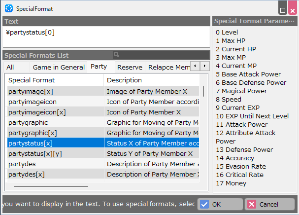
- Status X
It means that the parameter [x] specifies which status of the party member is to be displayed.
When you try to put this special format in the dialog, a list will appear telling you which numbers refer to what, as shown in the figure below. In this case, if you put [1], it will show you the maximum HP, and [2] will show you the current HP.
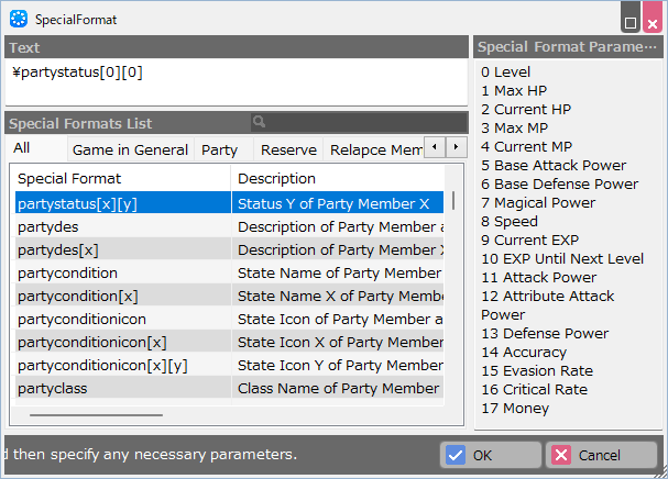
\partystatus [x][y]
This is a special format meaning "status Y of party member X".
The difference from the previous example is that there are two parameters, and the party member number is directly specified by the parameter [x] instead of the parent Container Management Number.
- Party Member according to Container Management Number
In this case, you can display something of the party member whose number is specified by "X".
- Status Y
Same as the previous example. In [Y], put the number you need from the list that appears on the right.
\partyimage
Image of Party Member according to Container Management Number
- Image
The special format described as "Image" displays an icon or image.
Basically, it displays the images specified in the "Database" menu.
If the image has been replaced by an in-game event, the replaced image will be displayed.
\currentitemstatus
Status of Selected Item in Possession
- Selected
When the word "Selected" is used in the description, data related to the entry for which the cursor is positioned in the menu is displayed.
Text Panel Properties†
- Basic
Specify basic settings such as the position of layout parts.
- Display Position X / Offset X
Specify the X coordinate of the layout part.
If it is a child of a container, specify the horizontal (X) offset value from the parent part.
- Display Position Y / Offset Y
Specify the Y coordinate of the layout part.
If it is a child of a container, specify the vertical (Y) offset value from the parent part.
- Horizontal Size
Specify the width of the display size of the layout part.
- Vertical Size
Specify the height of the display size of the layout part.
- Display Origin
Specify the display origin of the layout part.
- Visible
Specify settings related to the visualization of layout parts, such as images.
- Specify What to Display in the Panel
Fill in the text to be displayed or special formats.
Clicking on it opens the Insert Special Format Support dialog, where you can fill in your text.
- Regular text and special formats can be mixed.
e.g.: Lv.\partystatus[0] (Lv. is normal text and \partystatus[0] is a special format.)
- Multiple lines can be entered by starting a new line.
- Text Scale
Specify the scale value of what is being displayed.
To accommodate changes in game resolution, font sizes are also specified in scale rather than in points.
- Color
Specify the text display color.
For images, the specified color is multiplied by the color of the original image.
- Inactive Color
Specify the display color for the disabled text state.
- Status Up Color
Specify the display color for the text status up state.
- Status Down Color
Specify the display color for the text status down state.
- Outlines
Outline the text.
- Shadow
Shadow the text.
- Italic
Italicize the text.
- Bold
Bold the text.
- Auto Line Break
If the number of letters does not fit in the horizontal size, it will be displayed on several lines.
- Clipping with Parent Container
If it is specified outside of the parent container, it will not be displayed.
- Auto Line Break
If the text to be displayed does not fit into the horizontal size of this panel specified in Basic, it will automatically wrap.
- Clipping with Parent Container
If the text or image to be displayed is specified to be displayed beyond the parent container, it will be clipped and will not be displayed.
- Container Management Number
Display the Container Management Number applied to this panel.
The value will be the same as the Container Management Number of the direct parent container.
Sprite Panels"†
This panel can display "sprites" created by the Sprite Tool.
Images specified by sprites can also be displayed.
It is mainly used to display graphical elements with animation.
Sprite Panel Properties†
- Basic
Specify basic settings such as the position of layout parts.
- Display Position X / Offset X
Specify the X coordinate of the layout part.
If it is a child of a container, specify the horizontal (X) offset value from the parent part.
- Display Position Y / Offset Y
Specify the Y coordinate of the layout part.
If it is a child of a container, specify the vertical (Y) offset value from the parent part.
- Visible
Specify settings related to the visualization of layout parts, such as images.
- Sprite Set
Specify the sprite set to be displayed. The image specified for each motion in the sprite set is displayed.
- Motion During Display
Specify the motion being displayed.
- Appearance Motion
Specify the motion at appearance.
- Disappearance Motion
Specify the motion at disappearance.
If any motion is assigned in the Motion field above, clicking on the pen icon will launch the Sprite Tool, which allows you to directly edit the motion.
- Color
Multiply the image of the specified sprite set by the color specified here.
Slider Panels†
This panel displays gauges that expand and contract according to changing values, such as the HP gauge.
You can also create a slider that changes "value" as the user moves the thumb (knob), if placed as a child of a submenu container and a specific action is specified.
The volume setting for BGM/SE on the configuration screen is equivalent to this.
For an example of how to use the slider panel, please refer to the default layout of the "Config" screen and the "Battle Status" screen of the sample project "Orb Stories" in the Top Menu > Game Gallery.
Key Properties†
This section describes the key property options of the slider panel.
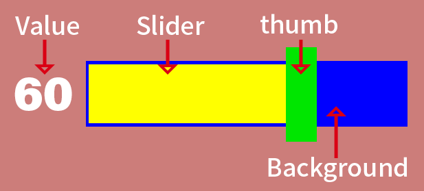
- Visible
The slider display consists of "orientation to stretch", "background", "slider", "thumb", and "text of the value (indicated by the slider)". The "thumb" is a so-called knob that can be dragged left or right to change its value.
Each image may not be assigned.
- Parameters Reflected in the Slider
Specify which parameters are to be displayed with the slider in a special format. A dialog box will appear allowing you to select the format.
- Response Range Extension Size
When using a slider with a thumb, the response range of the mouse operation is extended by this value.
Some properties, such as "Initial Value," are only effective with sliders in the form of user-operated value changes.
- Change Slider Color by Value
This function can be used, for example, to set the bar to red when the HP reaches a certain percentage. 2 levels (3 levels with default) can be specified.
Slider Panel Properties†
- Basic
Specify basic settings such as the position of layout parts.
- Display Position X / Offset X
Specify the X coordinate of the layout part.
If it is a child of a container, specify the horizontal (X) offset value from the parent part.
- Display Position Y / Offset Y
Specify the Y coordinate of the layout part.
If it is a child of a container, specify the vertical (Y) offset value from the parent part.
- Horizontal Size
Specify the width of the display size of the layout part.
- Vertical Size
Specify the height of the display size of the layout part.
- Scale X
Specify the display scale of the horizontal (X) axis of the layout part.
- Scale Y
Specify the display scale of the vertical (Y) axis of the layout part.
- Visible
Specify settings related to the visualization of layout parts, such as images.
- Slider Orientation
Specify the orientation in which the slider will extend and retract, either "Up/Down" or " Left/Right".
- Background Image
Specify an image to be placed in the background of the slider.
- Background Image Color
Multiply the specified image by the color specified here. You can create an image in all white and use this entry to specify the display color.
- Frame Thickness
Specify the thickness of the frame when the background image is specified as "Display Rectangle".
- Frame Color when Rectangle is Used
Specify the display color when the background image is specified as "Display Rectangle".
- Slider Image
Specify the slider image.
- Slider Image Color
Multiply the specified image by the color specified here. You can also create an image in all white and use this entry to specify the display color.
- Thumb Image
Specify the image that will be the slider's knob.
- Display Value as Text
The value that changes as a result of the user's manipulation of the slider is displayed as a number with text.
- Slider Text Color
Specify the color of the "value" text to be displayed.
- Offset X of the Value
Specify the offset value in the horizontal (X) direction of the "value" to be displayed.
The origin is the center of the slider.
- Offset Y of the Value
Specify the vertical (Y) offset value of the "value" to be displayed.
The origin is the center of the slider.
- Scale of the Value
Specify the scale of the value to be displayed.
- Control
Specify the behavior of the layout parts.
- Initial Value
Specify the initial value of the action set by the submenu container.
Gauges that vary according to parameters such as HP value are disabled when used.
- Upper Value Limit
Specify the maximum value of the slider.
Gauges that vary according to parameters such as HP value are disabled when used.
- Lower Value Limit
Specify the minimum value for the slider.
Gauges that vary according to parameters such as HP value are disabled when used.
- Parameters Reflected in the Slider
Specify a value to be displayed by the slider, such as the HP bar of a party member in a special format or the value of a variable created by an event.
Clicking on the arrow displays a dialog box with special formats that can be specified.
- Response Range Extension Size X
Widen the horizontal (X) value of the cursor's response range beyond the actual slider appearance.
Gauges that vary according to parameters such as HP value are disabled when used.
- Response Range Extension Size Y
Widen the vertical (Y) value of the cursor's response range beyond the actual slider appearance.
Gauges that vary according to parameters such as HP value are disabled when used.
- Change Slider Color by Value
Changes the color of the slider when the parameter falls below a specified percentage. Two levels can be specified.
- Color Change Start Rate
Specify the percentage of the maximum value of the parameter by which the color of the slider should change.
- Slider Image Color after Change
Specify the color of the slider after the change.
- Change Slider Color by Value 2
Change the color of the slider when the parameter falls below a specified value. Two levels can be specified.
- Color Change Start Rate
Specify the percentage of the maximum value of the parameter by which the color of the slider should change.
- Slider Image Color after Change
Specify the color of the slider after the change.
Spin Panels†
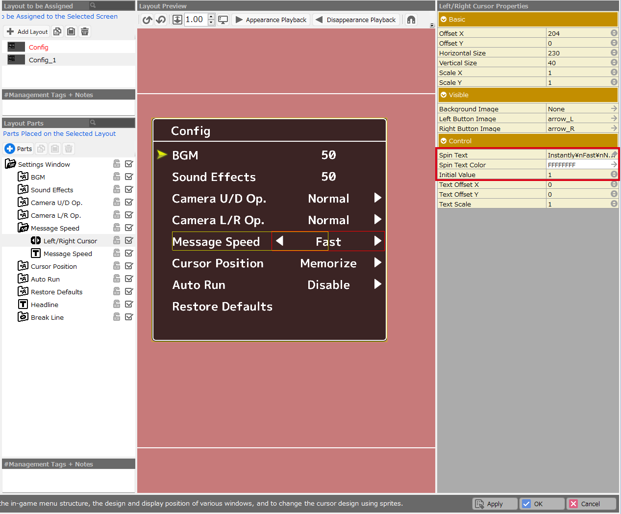
This panel provides a mechanism for selecting text entries with left and right input operations. It is used in situations where "Fast/Normal/Slow" is selected by toggling the left and right keys.
Currently, it is only effective in the "Config" screen.
Key Properties†
The following is a description of the key property options of the spin panel.
- Spin Text / Initial Value
Specify the text that will be displayed when entering left or right and which of the texts will be displayed as the default in the game.
(For text, insert \n for separating words.)
In the example shown above, there are four selections: " Instant", "Fast", "Normal", and "Slow".
The "Initial Value" section is set to "1".
"Instant" corresponds to "0," "Fast" corresponds to "1," "Normal" corresponds to "2," and "Slow" corresponds to "3," so in this case, the default displayed in the game is "Fast".
Spin Panel Properties†
- Basic
Specify basic settings such as the position of layout parts.
- Display Position X / Offset X
Specify the X coordinate of the layout part.
If it is a child of a container, specify the horizontal (X) offset value from the parent part.
- Display Position Y / Offset Y
Specify the Y coordinate of the layout part.
If it is a child of a container, specify the vertical (Y) offset value from the parent part.
- Horizontal Size
Specify the width of the display size of the layout part.
- Vertical Size
Specify the height of the display size of the layout part.
- Scale X
Specify the display scale of the horizontal (X) axis of the layout part.
- Scale Y
Specify the display scale of the vertical (Y) axis of the layout part.
- Visible
Specify settings related to the visualization of layout parts, such as images.
- Background Image
Specify an image to be placed in the background of the spin operation panel.
- Left Button Image
Specify an image for the left button.
- Right Button Image
Specify an image for the right button.
- Control
Specify the behavior of the layout parts.
- Spin Text
Specify the text (selections) to be displayed. You can specify the order in which the strings are displayed by separating the strings with \n.
(e.g.: Instant\nFast\nNormal\nSlow)
- Spin Text Color
Specify the color of the text to be displayed in the panel.
- Initial Value
Specify the default value to be displayed.
(e.g.: When the text "Instant\nFast\nNormal\nSlow" is entered, enter 0 to specify "Instant" as the default value.)
- Text Offset X
Specify the horizontal (X) display offset value of the text from the panel origin.
The origin is the center of the panel.
- Text Offset Y
Specify the vertical (Y) display offset value of the text from the panel origin.
The origin is the center of the panel.
- Text Scale
Specify the scale of the text.
![[PukiWiki]](./skin/BAKIN_logo_92.png "[PukiWiki]")


 LayoutTool_SliderPanel.png 34 download
[Information]
LayoutTool_SliderPanel.png 34 download
[Information]
 LayoutTool_SubMenuContainer.png 49 download
[Information]
LayoutTool_SubMenuContainer.png 49 download
[Information]
 LayoutTool_SpritePannel_base.png 54 download
[Information]
LayoutTool_SpritePannel_base.png 54 download
[Information]
 LayoutTool_RenderingContainer.png 51 download
[Information]
LayoutTool_RenderingContainer.png 51 download
[Information]
 LayoutTool_MenuContainer.png 47 download
[Information]
LayoutTool_MenuContainer.png 47 download
[Information]
 LayoutTool_SpinPannel.png 113 download
[Information]
LayoutTool_SpinPannel.png 113 download
[Information]
 LayoutTool_SpecialFormat_2.png 142 download
[Information]
LayoutTool_SpecialFormat_2.png 142 download
[Information]
 LayoutTool_SpecialFormat.png 134 download
[Information]
LayoutTool_SpecialFormat.png 134 download
[Information]
 LayoutTool_TextPannel.png 136 download
[Information]
LayoutTool_TextPannel.png 136 download
[Information]
 LayoutTool_Slider_Sample.png 140 download
[Information]
LayoutTool_Slider_Sample.png 140 download
[Information]
 LayoutTool_Pannel.png 135 download
[Information]
LayoutTool_Pannel.png 135 download
[Information]
 LayoutTool_Container.png 134 download
[Information]
LayoutTool_Container.png 134 download
[Information]
 24_menuspin.png 142 download
[Information]
24_menuspin.png 142 download
[Information]
 24_menuslider.png 140 download
[Information]
24_menuslider.png 140 download
[Information]
 24_image.png 147 download
[Information]
24_image.png 147 download
[Information]
 24_text.png 142 download
[Information]
24_text.png 142 download
[Information]
 24_container.png 144 download
[Information]
24_container.png 144 download
[Information]
 24_menuitem.png 143 download
[Information]
24_menuitem.png 143 download
[Information]
 24_menuSys.png 136 download
[Information]
24_menuSys.png 136 download
[Information]
 Container_MG_No.png 160 download
[Information]
Container_MG_No.png 160 download
[Information]